Creative approaches to font display on the web
Nowadays, fonts seem to have conquered the web. The @font-face CSS property is everywhere and the use of it has even reached far beyond the display of characters1. But there was a time, not so long ago, when web designers had to struggle with complex processes to be able to display the title of a blog article in the typography of their choice.
At its core, the web has always been text. But the glyphs to display it had to be local. So when designers embraced the medium, the only choices they had was what most people had on their machines (Arial, Courier New, Times New Roman, Webdings,…2). The obvious solution was to replace text by images, either precooked by the designer (him|her)self, or baked on the fly and cached by the server. This technique, although widely used, was not that elegant. It was heavy on the server and on the bandwidth, plus those little rendered texts where not selectable or scalable.
To circumvent these flaws, some came with another approach called sFIR3, which included in the web page a small Flash™ file embarking the desired font. Selected pieces of text would then dynamically be replaced by Flash rendered text, all done in the browser. Text would still be scalable and selectable. But it required a proprietary plugin to be displayed correctly and don’t even dream about printing it.
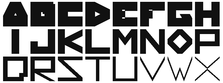
So when I came to design my web portfolio, none of these solutions really appealed to me. I wanted to stick with text based open standards and no “image trick”. The <canvas> tag was then only supported by half of the browser market. And I was starting to get interested in “everything parametric”. The font4 I was working on used a single closed polygon for each of its glyphs. Each letter was just a set of coordinate relations that would allow me to change the weight and proportions of it at will. To display it in the browser, I found some obscure Javascript library created by Walter Zorn5 that exposed a set of vector drawing functions. The way the library worked was to create a colored <div> for each pixel of the drawing using some fast algorithm to prevent too much repetition and combine as many pixels possible into one <div>. It worked remarkably well across browsers and still works in recent ones because it just uses a basic brick from HTML. The “pixelated” look of it was also very pleasing to me.
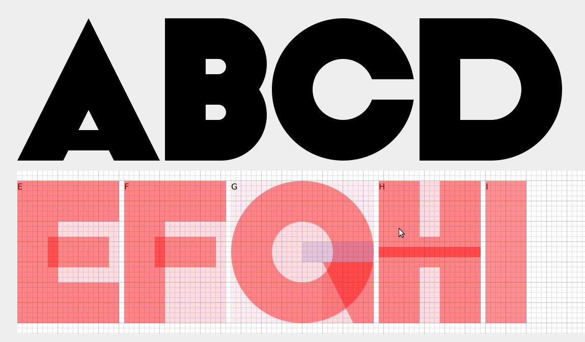
After this little personal project, I kept my eyes open for unusual font drawing experiments in the browser, especially the ones involving code. I was impressed by Dave Desandro’s Curtis CSS typeface6 which is a pure HTML/CSS font using a combination of background color, border width, border radius and a lot of <span> tags to draw a set of very pleasing fat characters. This is especially remarkable because it doesn’t rely on Javascript and so makes it a very good candidate for the “displays-everywhere” award.
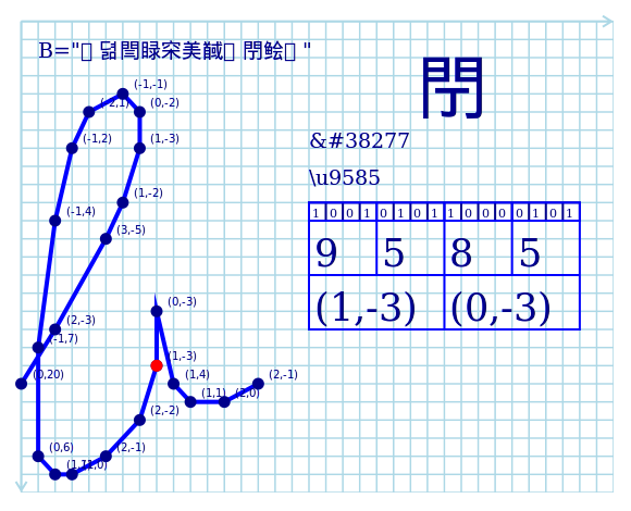
Another experiment to notice is Claudio Cañete’s 1k Notebook6 project to implement a full parametric font in <canvas>… in just under 1 kB. He first used a 3×7 grid of nodes to draw a custom line based font. But since this wasn’t really using much space of the 1024 bytes available, he pushed further by porting a script typeface from the Hershey font collection8 and tweaked it to draw the glyphs in a continuous single trace. The encoding and decoding of the font is where Claudio’s work happen, to stay under that limit he set himself. And this is where lies beauty.
With the latest HMTL specifications, pretty much any typeface can be displayed in a web page, and, don’t get me wrong, this is such a relief. But creativity gets its strength from the constraints it faces. So there is still room for inventiveness with font rendering in the browser. Just set yourself the limits of your canvas.
Julien 7:02 pm on May 10, 2014 Permalink | Log in to Reply
Still need to find a way to make some 300dpi or vector images for all these font projects. Any idea?
Julien 11:08 am on May 12, 2014 Permalink | Log in to Reply
After a (private) discussion on twitter with Claudio about his work (1k Notebook), he has informed me that he releases it under the CC-by license: http://creativecommons.org/licenses/by/4.0/
Julien 10:20 am on May 13, 2014 Permalink | Log in to Reply
If that can be of any help, I’ve ported the Curtis CSS typeface to LESS. So it’s now easier to change the size and color. Here is where you can play around with it: http://xuv.github.io/curtis-less-typeface/ Although, some glyphs don’t render well when you try to print them. (Print works with the letters “c,d,h,j,lo,q,u,v” only for now)
Manuel 11:06 pm on May 13, 2014 Permalink | Log in to Reply
Cool, thanks Julien for the article. Great to know that it lead to the liberation of the 1k Notebook code ! :)
Julien 12:35 pm on May 14, 2014 Permalink | Log in to Reply
:) Well. It had to be published under some libre license, no? Because, if not, we could not use any graphics from that project. Anyway, Claudio is willing to adapt his project so it outputs higher resolution graphics. Do I ask him to do this? Or do we keep it like that?