Hello ginger, Ana, Ricardo and Manuel.
Here is a subject, in form of a story, which could be turned into a proposition of some kind.
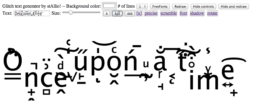
I started to get interested in fonts for the web, before the @font-face specification. As you remember, we didn’t have much choice. Either, we had to guess the fonts the user would have (which would be 90% windows defaults). Or use php-gd on-the-fly srever-side baked images or some flash app as a way to display more fancy fonts for blog titles mainly.
Anyway, because I can’t do things like everyone and because I didn’t want to send baked-images nor use flash for my website, I tried rendering fonts, in javascript, in the browser. You must also know that there was no <canvas> tag available at that time either.
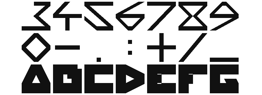
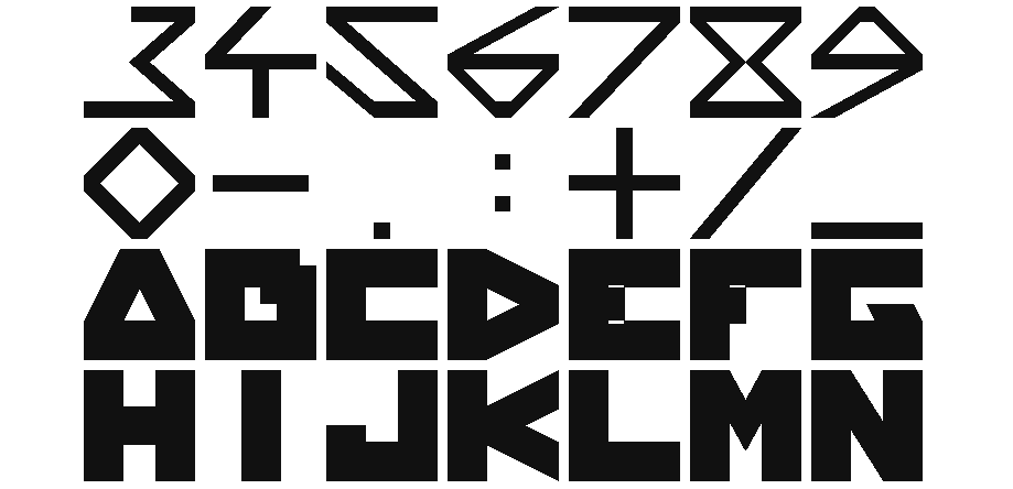
So I used some cryptic js library that would draw in the browser using only absolute divs. I also created my own parametric font, where each gliph would be a single closed shaped polygon. And I used (and still use) it for my logo and the titles of my website http://xuv.be.
Here’s an example of the font with 3 weights.
http://xuv.be/static/xuvfont/typo.html
I never (took the time to) release(d) that font. But I thought about it and thought about porting it to other languages also (like processing for example).
Anyway. This got me interested in other projects like this. And I found 2 of some sort.
One is the Curtis CSS typeface by Dave Desandro
http://desandro.github.io/curtis-css-typeface/
(A pure html-css only typeface)
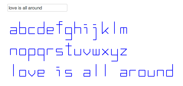
The other is the 1kJS experiment http://www.claudiocc.com/the-1k-notebook-part-i/ (By Claudio CC ?)
So, my proposition could be to write about these weird web type face experiments and try to find some more relevant work around these ideas. (So the criteria here would be not to use a font file as a source, but just html-css-js).
Or another proposition could be that I talk about my font project and release the xuv-font in different languages.
Or also could be just images of these 3 projects in some sort of quick and weird showcase section.
Tell me what you think about this.
And if you found this interesting, I can start cooking ;)
Manuel 10:45 am on April 16, 2014 Permalink | Log in to Reply
Samuel writes:
merci beaucoup pour l’intérêt (…) je suis très flatté, et tout à fait partant pour contribuer à cette édition.
Je voulais venir au LGM de Leipzig cette année mais je n’ai finalement pas pu. Ça fait deux fois que je le loupe. La prochaine fois je serais là, promis.
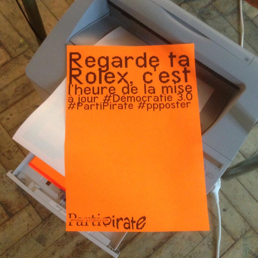
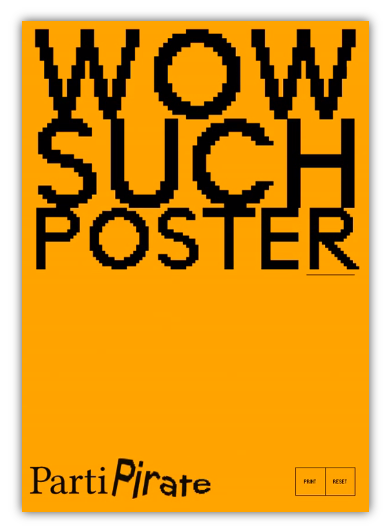
Par rapport au projet Easy Poster (nom plus ou moins « par défaut » ), comme tu as du le voir, c’est un prototype d’outil permettant de mettre en page facilement et rapidement une affiche.
Les paramètres sont très simples : le corps du texte de chaque ligne varie automatiquement pour que la longueur de la ligne s’adapte à la largeur de l’affiche; et un retour à la ligne permet de créer une nouvelle ligne de texte.
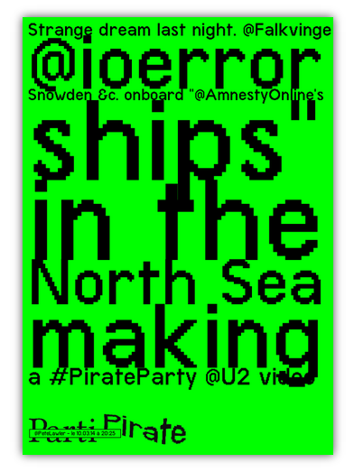
L’idée de départ était d’expérimenter autour d’un outil qui pourrait être utilisé par des militants sans grandes connaissances en graphisme pour mettre en page des affiches ayant un maximum d’impact en un minimum de temps. Ça permet aussi de faire de l’Ascii Art un peu bizarre. Il y a quelque chose d’assez brut qui m’a ensuite fait pensé à la spontanéité de Twitter (on peut en quelque sorte considérer cet outil comme la version papier de twitter). C’est pour ça que j’ai décliné le principe pour mettre en page des tweets automatiquement (en rajoutant aléatoirement des retours à la ligne) sélectionnés en fonction de mots clefs liés au parti pirate. (cf : http://www.samuelriversmoore.net/#PPPI-twitterposters )
(…)
Les sources de mon projet sont disponibles depuis peu sur Gihub : https://github.com/SamuelRiversMoore